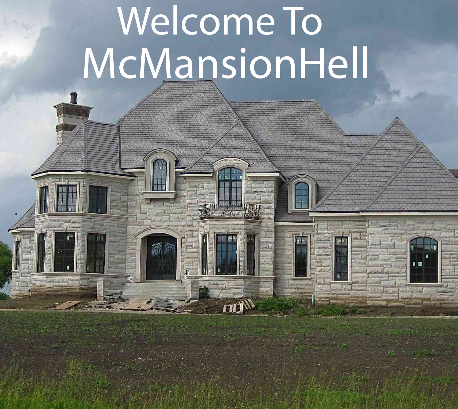
Ash for grass??? Blinding white??? Also the neighborhood roads are a nightmare.
It’s brand spanking new, and it was completed and listed in winter. Landscaping can’t be done during winter, the grass or hardscaping will come in May/June when it warms up.
Understandable
The thing could definitely use some contrast or colour though, still a contender.
The neighbours gravel yard isn’t giving me much hope that they’ll add some colour with the landscaping though.
I 100% thought this was just a 3d rendering of the house until I read your comment. It looks so weird and fake.
Yo I heard you like garages, so we added a garage beside your garage and another garage on to that pointed the other way.
Seriously, the floor plan is more garage than living space.
The design is just wacky. Why do the garage doors face two different ways? What’s even the point of that extruding garage?
AI trying to draw hands be like
Jeez, the snout on that thing!
Every room looks cold and echo-y. Not a single carpet anywhere, and it’s all a hideous monochrome. That photo with the TV in it looks like the world’s most miserable media room.
It’s staged for sale. You want it to be monochrome. The color is added when the people eventually living there bring in their decorations, pictures, plants, etc.
What’s with the weird kitchen off the kitchen?
Though I guess it goes with the garage off the garage.
Spice kitchen. They’re great when you are cooking something extra smelly when they’re built with excess ventilation, or they’re often used to separate food for someone with a severe allergy away from the rest of the food preparation.
TIL thanks!
The staging on the pics is awful, too. It makes the house look even more sterile and empty. The way they jammed that L shaped couch in that little room like it’s a living room is bizarre. Also the kitchen looks just terrible without an island counter in the middle.
Hideous and soulless. A little bit of Dubai in Edmonton!
Spectacularly awful use of the lot space. That layout is really shit. Like a house that had been added onto over a couple ownership changes, but every owner tried to do things the cheapest possible way. Or started the addition themselves, then had to have an actual tradesman come in and fix/finish their fuckups.
It’s an insult to even try to cram another house into that lot. The other houses look extremely close together for their size - pure money grab by the developers. They should have just expanded all the other lots by 10 feet and given the houses a little bit of a yard.
Is this one of those pie-slice things? Bunch of narrow plots with a shared middle region? No - the road’s right there. What the hell, then.
Add 1 house, add 1 garage, add 1 story. Repeat.
This is how fractals get started.What really baffles me with North American suburbia is that people are willing to buy such gigantic houses with barely any garden, not even baby trees, no privacy and no fence and overall stupid floor plans. I mean, would anyone sane really pay over 1.5m for have a balcony that looks into their neighbours garden (or lack of garden)?
Yeah, i dont like it either. I would definitely prefer a house with mature trees and such
The inside would look a whole lot better with wood flooring
And on top of that, you’re in fucking Edmonton
Removed by mod


