
It seems they do not have data for ALOT of places…
Paris is not this green.
Same for london. It might be going by avg for a region
Might be, ports of Rotterdam and Antwerp both have clusters of heavy industries and they are green while parts further inland aren’t. Another reason the quality of air is not by pollution but by methane from farm animals? Not a lot of those in London either. What confuses me too is that the scale is ‘U.S. air quality’ I mean wtf is that?
What’s the source for this map? How old is the data?
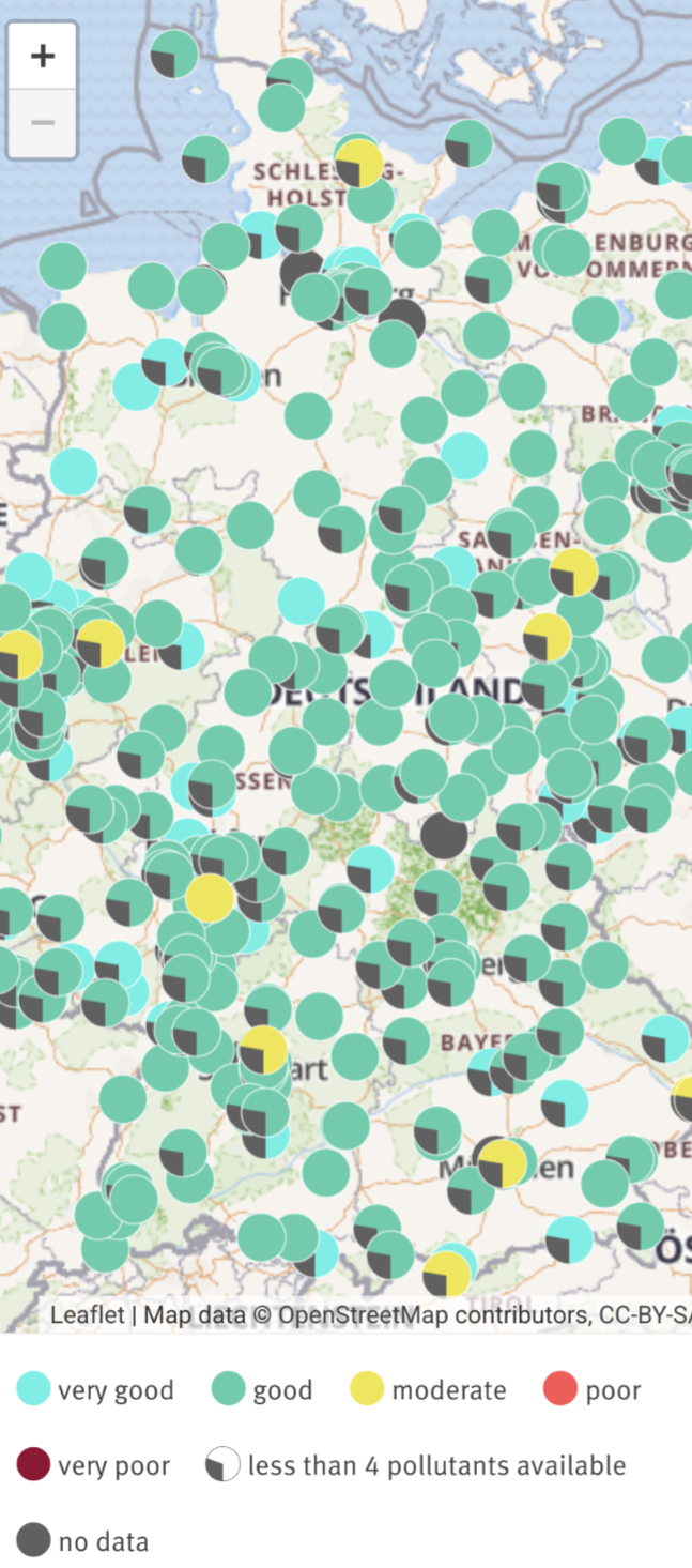
According to the german federal environment agency (Umweltbundesamt) everything is fine.
Is this because of coal industry over there ? Why is gerpany this yellow ?
It’s not. Air quality is very good or good in most places right now with the occasional moderate quality. The map OP posted is off or old.
Accurate data from the link I posted above
‘Portugal can fuck right off’
- cartologist probably
Portugal can’t even into Europe right now
The map have been removed it just shows

First, as others have stated: this is misleading, but that is fine as many maps are misleading and discussion around it is good so people who don’t often look at data or maps get more critical of what they see. An image with data but no sources is to be taken with a grain of salt.
Second (related to the first), where is the source. I could not find this map on US Air Quality Index so I guess its an app that pulls data from there (so they might be interpreting the data wrong or just took a snapshot of a specific datetime or whatever. Also I couldn’t even find data for europe on their website).
I went to reddit and here’s the original post that also lacks the source and the comments are pretty much the same as here.
That tracks… IMG


